Elekt – Product Strategy
Tasks
Strategy, Growth, Monetisation, Design system,
Time
6 Months
Working in collaboration with the Head of Product to create a vision and strategy that will result in subscription and revenue growth.
Using rapid prototyping and growth design techniques to validate features that meet user needs and foster growth.
Creating a strong onboarding and learning journey to help our 150k active users unlock value in the app and increase subscription by over 500%.
Context
Elekt is a Norwegian platform that helps customers in the Scandinavian region master their electricity usage. At a time when electricity prices are high, Elekt aims to help users understand their usage data, pricing structures and provide insights and practical steps to reducing energy costs.
In Scandinavian countries it is common practice to check electricity spot prices for the day, as you would the weather everyday.
However users do not know how to use this data to practically reduce their bill costs, especially when raw spot prices are not a true representation of what they are paying to their energy provider.
Business opportunity
Elekt had amassed an impressive 150k active users a month. However they only had 15 active subscriptions.
The main goal was to understand user needs in order to increase subscriptions by providing value.
Business Vision
“Our vision is to transform our extensive insights and over a million downloads into a valuable product that empowers users and is worth paying for.”
Our strategy
Simplify data
Make energy usage and data easy to understand for users.
Insights
Provide simple actionable steps to help users lower their costs.
Feedback
Surface data that shows users how their usage affects their final bill.
Data we have access to
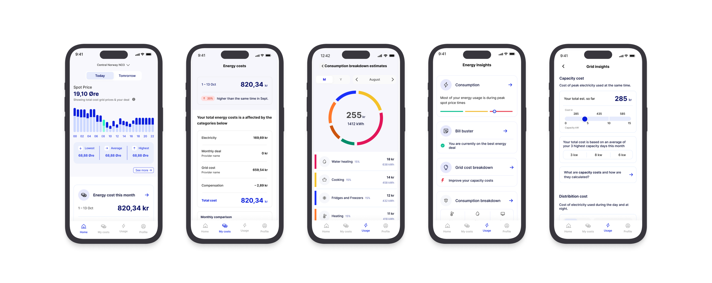
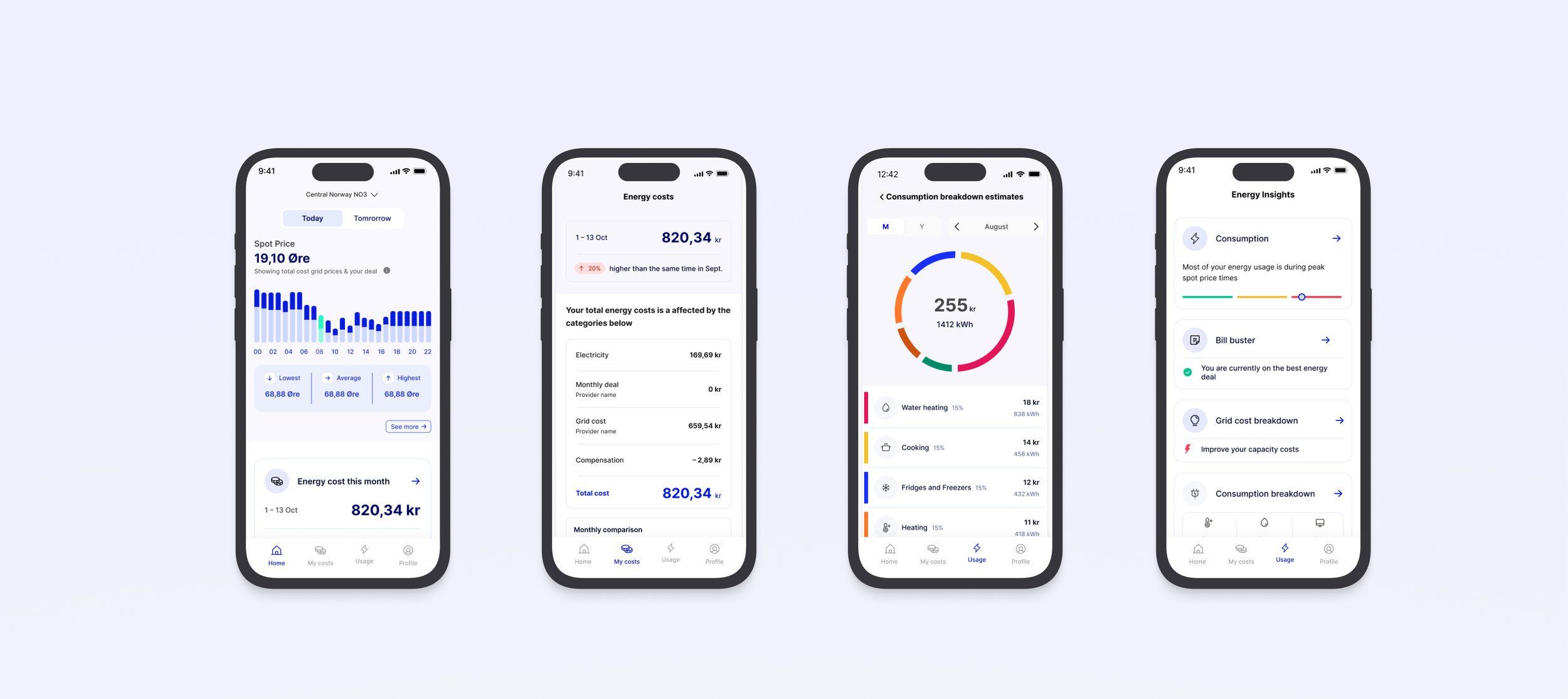
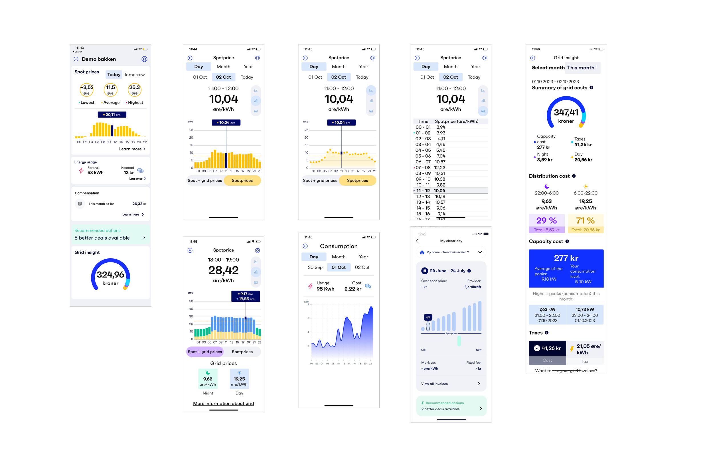
Spot prices
Graph showing the market price of electricity each hour.
Energy consumption
Live costs and kWh of electricity consumed by the user.
Grid insight
Break down of how electricity is charged based on day & night tariff, capacity and taxes.
Bill buster
Electricity deal checker, to see how your deal compares to others on the market.
Our users
“ I check the spot prices everyday, but don’t know what to do with that information ”

UX Audit
Research & understanding
The current app did not have an appealing design. This is important as good design that user friendly, creates trust with users, which is important for monetisation.
Too much raw data is being surfaced, which is complex to understand for a user.
The data lacks insights, making it difficult for users to take actionable steps to lower energy costs.
The screens look very similar, even though they are communicating different datapoints
The current app did not have an appealing design and lacks cohesive branding. This was detrimental as good design creates trust with users, which is important for monetisation.
Understanding the purpose of the data

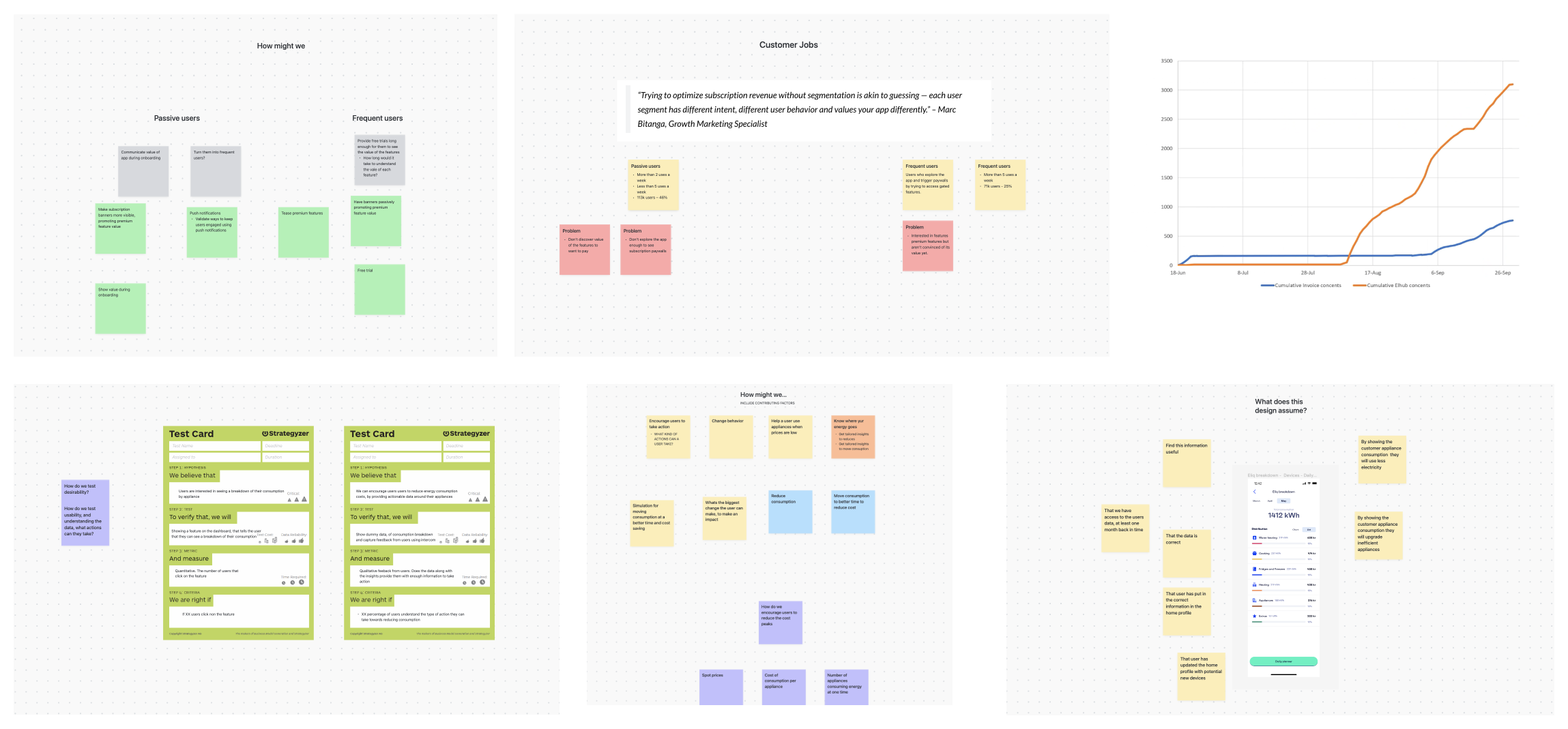
I conducted workshops with domain experts to understand the purpose of each data type.
Why do we need so many data points?
How do the different data points work together/ affect each other?
How does usage affect price?
We listed out informations goals for the data that was being surfaced and aligned them to customer needs.
How might we…
Use energy and price data, to provide value to users through actionable insights and increase subscription.
We believe that we can increase subscriptions by providing customers actionable insights about spot prices that are guaranteed to reduce their electricity bills.
We plan to do this by:
Simplifying the data we surface to help users understand how electricity is charged.
Live feedback of their usage and how it will affect their final bill.
Providing actionable steps that users can measure to see their progress.
Redesigning features and the app, to better surface data and improve brand identity, customer trust and navigation around the app.
Introducing free trials so users can experience the value of the improved features, and be enticed to subscribe.
Hypothesis
KPI’s
Increase the number of users who grant access to consumption data
Increase number of users granting access to invoice
Increase number of users who start free trials
Increase number of users who convert from trial to subscription
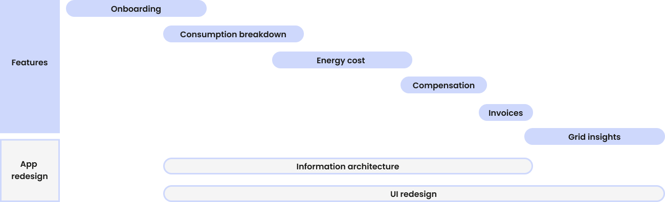
Roadmap of key initiatives
Validation testing
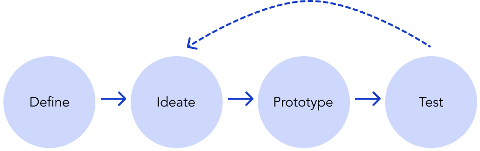
Each feature went through a 2 week design process where we produced a design solution, created a live prototype and released it live to a small segment of customers. This allowed us to gain feedback and measure user behaviour against kpi’s. We also tested some features with users to gain qualitative feedback
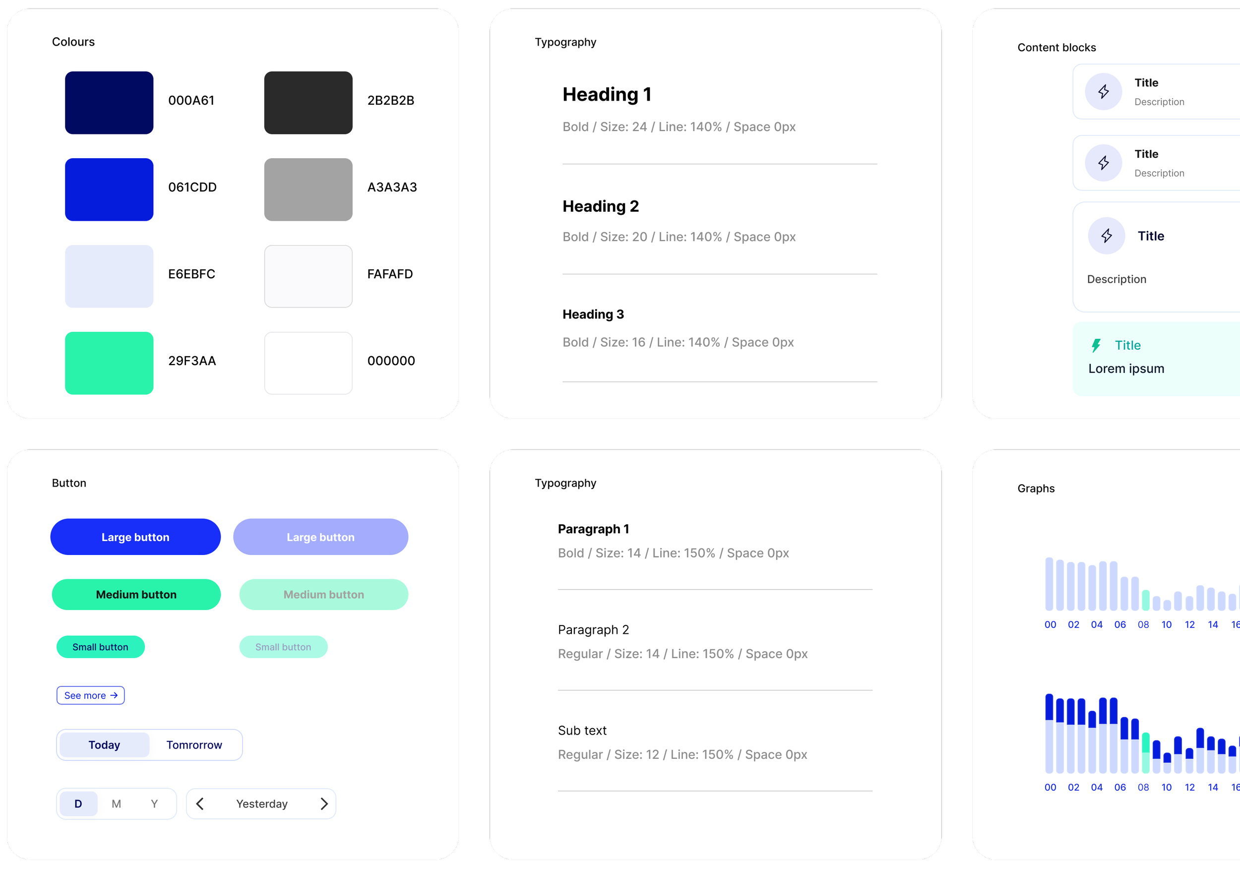
Design system
The aim was to modernise the visual aesthetic of the app, while keeping the vibrant electric colours. After conducting a thorough audit of the existing components, working with the marketing team, we established design principles, and patterns that aligned to the brand. The resulting system prioritised visual harmony, and data that was easy to read, a strong brand identity and lead to a streamlined development workflow.
Over 200+ new subscribers
With each feature, we measured the live test results against KPI’s over a period of 2 weeks. We then decided if the feature was a success.
Over a period of 3 months, with a new feature launching every few weeks, we managed to achieve 200+ active subscriptions.