Deliveroo New Riders
Tasks
Research, UX, UI, User retention
The Rider Life Cycle team focused on the touch points that riders had with Deliveroo. From onboarding, to how they find the information they need throughout their career at Deliveroo.
First Delivery
New riders feel unprepared to begin riding due to all the unknowns and they are also concerned about what the order experience looks like. This has resulted in many new riders not turning up to their first shift, in our Singapore market 25% of new riders are not activating. Activation is defined as completing the first 10 orders.
In order to feel prepared and reduce anxiety, applicants source further information from their rider friends and the rider trainers at the onboarding centre.
Business opportunity
Increase new rider activation, as the business spends alot of money in acquiring new riders.
To provide sufficient information that prepares new riders for working and reduces first shift anxieties.
There is a bigger goal to signing up all remote, and reduce in person onboarding. As this will remove riders' main source of information, new rider education needs to work remotely.
Research
“Where do I go to work? What will an order look like?”
We went to onboarding centers to conduct user research by speaking to people who have just signed up to work. From the research we have learned that these are the most important questions we need to solve for:
How do I book a session?
Where do I go to work?- New riders don’t understand where to go to receive orders.
I cannot visualise an order - what will it look like?- Riders are anxious about what they are expected to do to successfully complete and order through the app.
What do I do when something goes wrong on an order?
We started by auditing the current videos in the onboarding process to understand the information we are currently communicating and why new riders still felt unprepared. We realised that riders are shown this information before they complete the application forms. For them this is too early in the process. At that point they need information regarding pay and working hours. The videos could not be accessed after this point so riders are not able to refer back to them when they are ready to work.
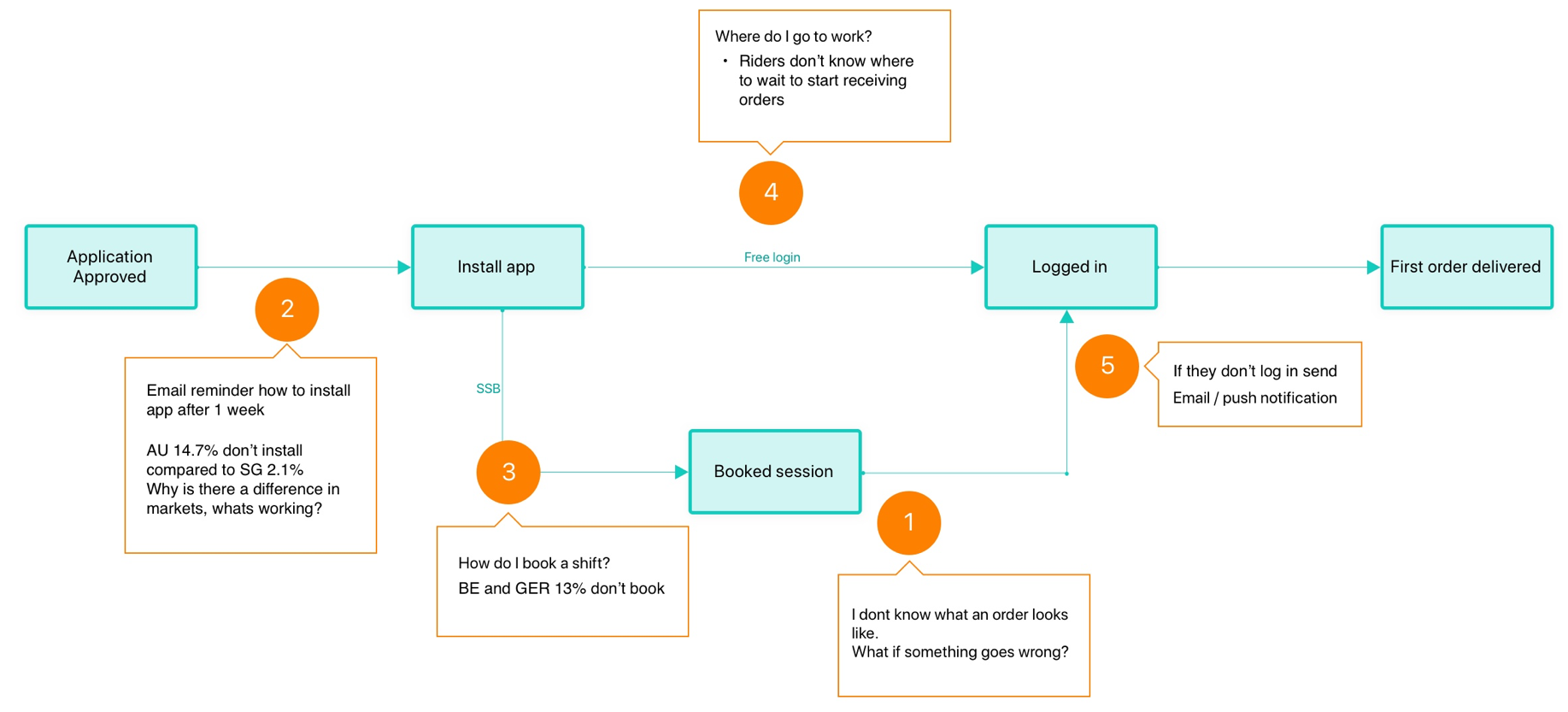
Activation flow
The flow shows the journey from the application being approved to the first order being completed. The numbered points show in order where we experience the biggest drop off from data. The highest one occurs after riders have booked a session, they become anxious about what the delivery experience will actually be like. We Our original assumptions were that the booking tool in the app was too difficult to use.
Design concepts
We learnt from research that the booking tool was very easy to understand, the main concerns were around being anxious of what the order experience was going to be like. Receiving the order in the app, going to the restaurant and delivering to the customer.
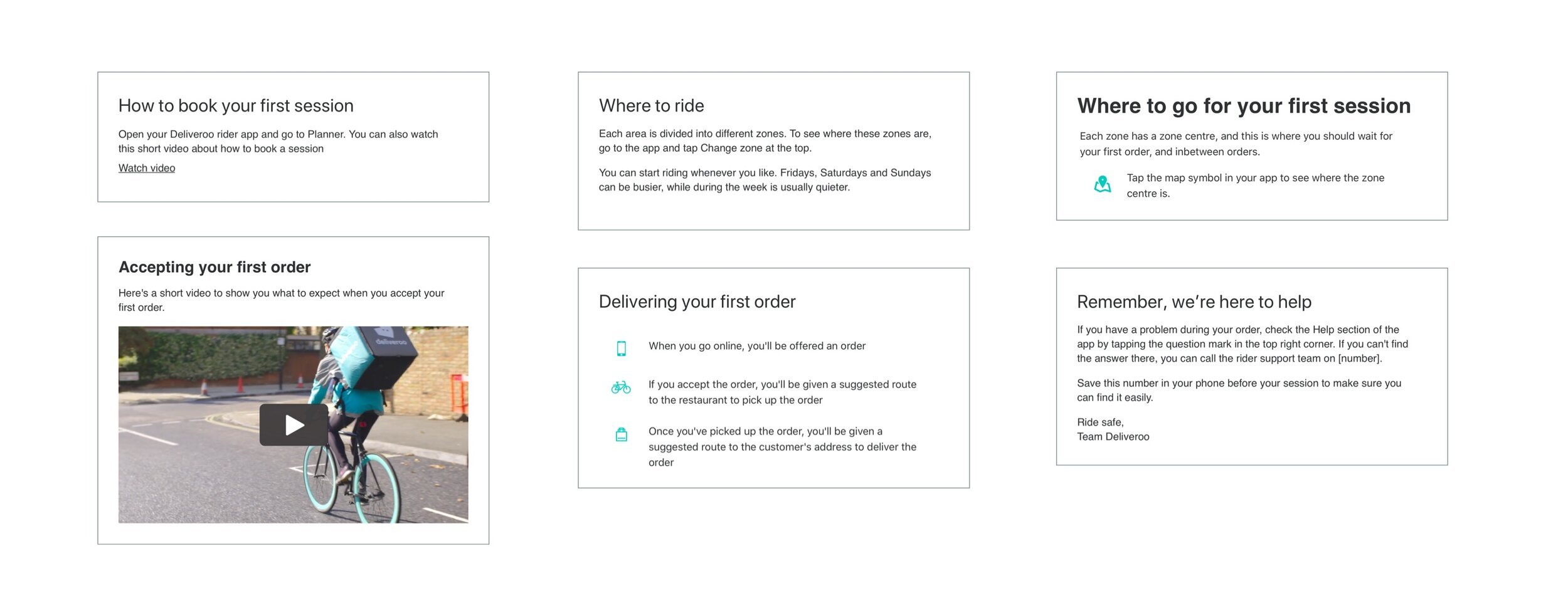
As the new onboarding system will take a few months to build, we plan to solve this problem using emails and the rider blog website. These are the modules for each topic.
Testing
We tested the modules as emails at an onboarding center with newly approved riders. Even though the new riders had just seen this information during the application process, they liked the idea of being able to go back to the information to refresh their minds before their first session.
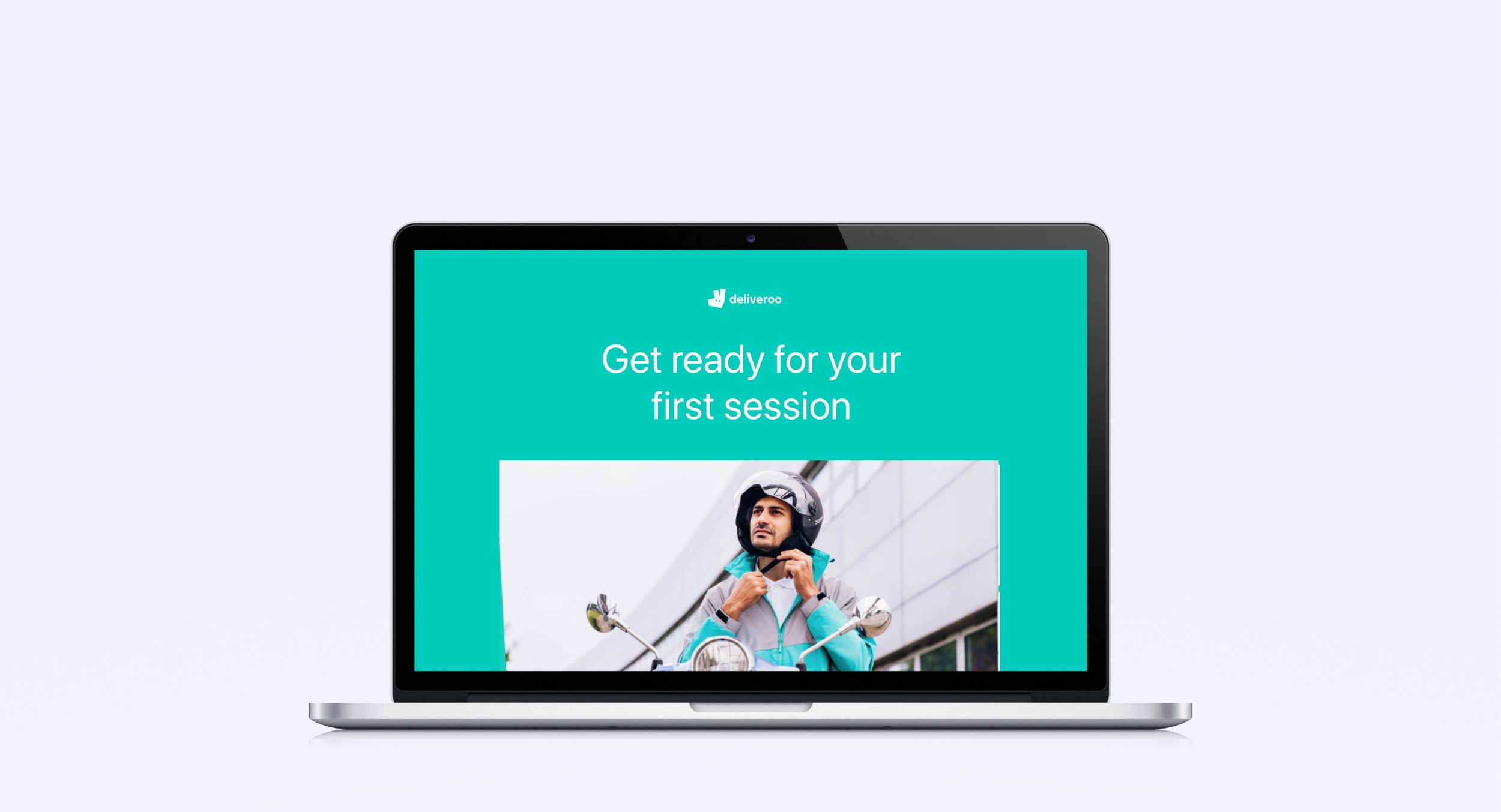
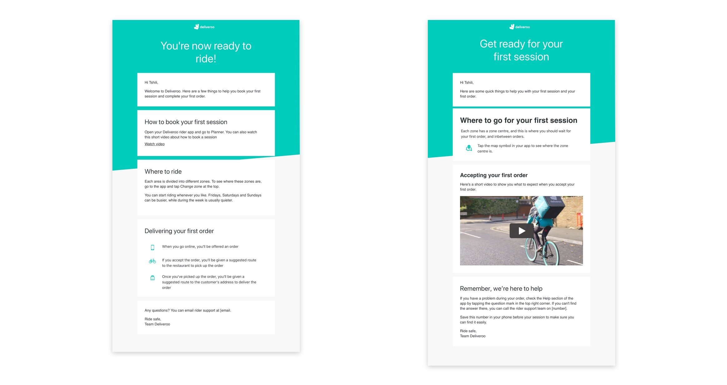
The final design was made up of 2 emails that the rider received before booking a session and after booking one. The content in the first email is designed to encourage riders to book a session by outlining the steps of delivering an order and giving them directions of how to decide where to work.
Once they have booked a session a second email is triggered containing more detailed information about what to expect on the first session and directing them where the best place to wait for an order.
We ran a test in Singapore and the UK for 2 weeks, and we saw a slight increase in activation, by 12%.
The open rate of the emails was not as high as we expected. From previous conversations with new riders, we believe this could be due to the amount emails they receive in the current onboarding system. Riders have expressed how annoying they find these emails, this will be different in the new onboarding system that is being built as everything will be done within the website. With the results we have seen we expect activation to increase over time as we have been able to identify the information the riders were lacking.
Outcome
Rider app download
Challenge
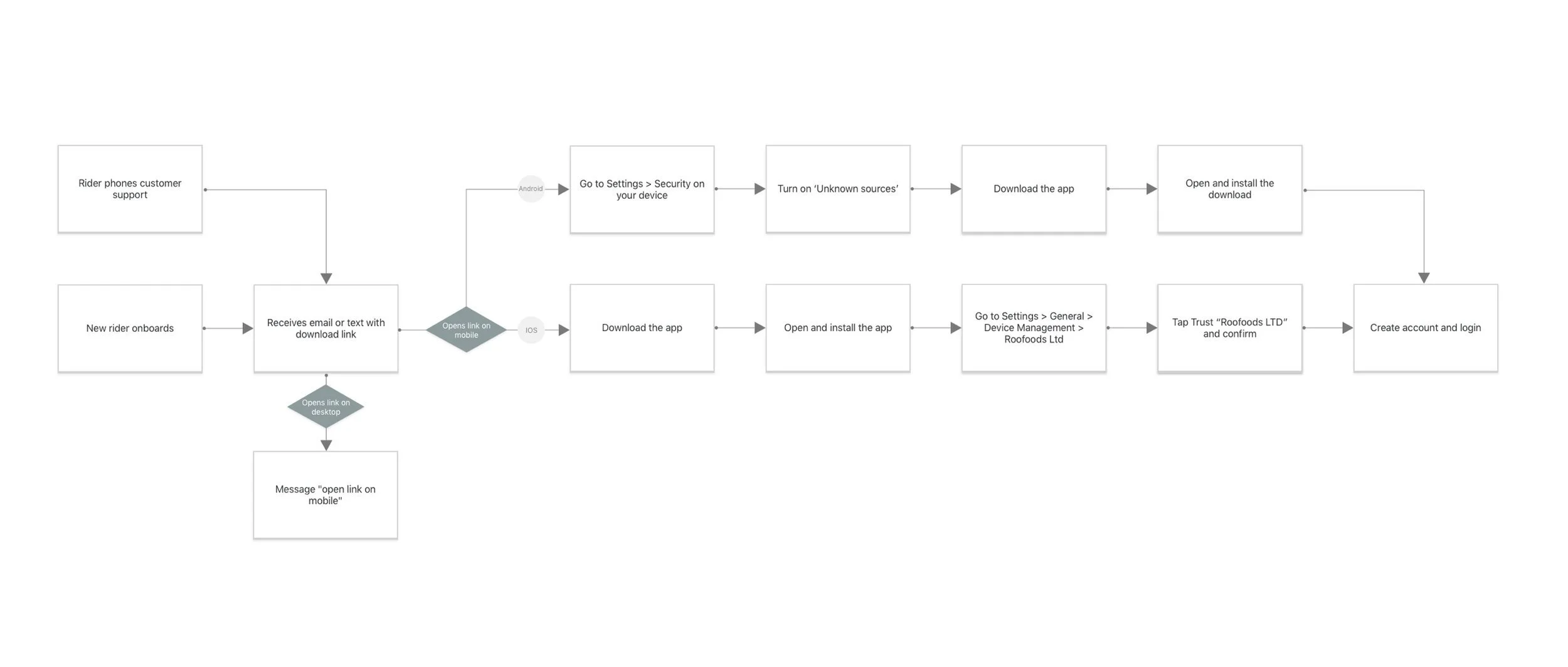
The Rider app is not on the app store. To download the Rider app a unique link is sent to them via email or text which expires within 3 hours. This directs them to a download landing page. The call centre in Singapore received approximately 2500 requests in the last 3 months, and nearly 4000 in the UK.
Goal
The aim is to reduce the number of queries the support teams receive asking for the app link to be resent. The aim is to build a public facing landing page that will live on the Rider community website, which will allow anyone to download the Rider App at any time.
Old design
This is what users saw when they accessed the unique link sent to the. To use the app the user needs to over rider some security settings, which is done differently on IOS and Android. The old download page only showed instructions for IOS and not android.
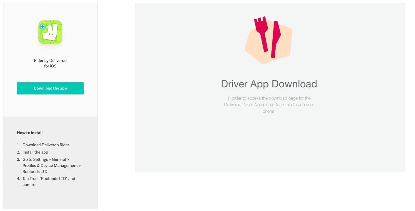
New Designs
Desktop
The message is short with a clear call to action
The illustration is in context to the action the user needs to take.
By adding the tab at the top and using the style guide for the text, has resulted in a design that is on brand, with copy that is more legible.
Mobile
By using the style guide to build components, has resulted in a design that is consistent across the brand.
Install instructions above the fold
Install steps are broken up into steps, visually which will help guide users through.
Hierachy of install is dependent on the user's operating system.
