Yoox Net-a-Porter
Tasks
Research, UX, UI, User retention
After Yoox acquired Net-a-Porter and its sub brands, there was a major project to migrate them all onto one unified platform. As part of the commerce team, I have worked on re-designing the My Account section, Shopping bag and Checkout journey.
Goal
The objective was to create a unified design journey across all brands and deliver a fully responsive application that provides an intuitive user experience. This involved working closely with business, analytics, delivery logostics, and the development teams in London and Italy.
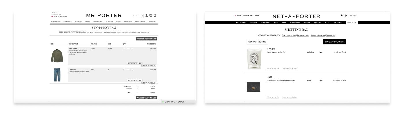
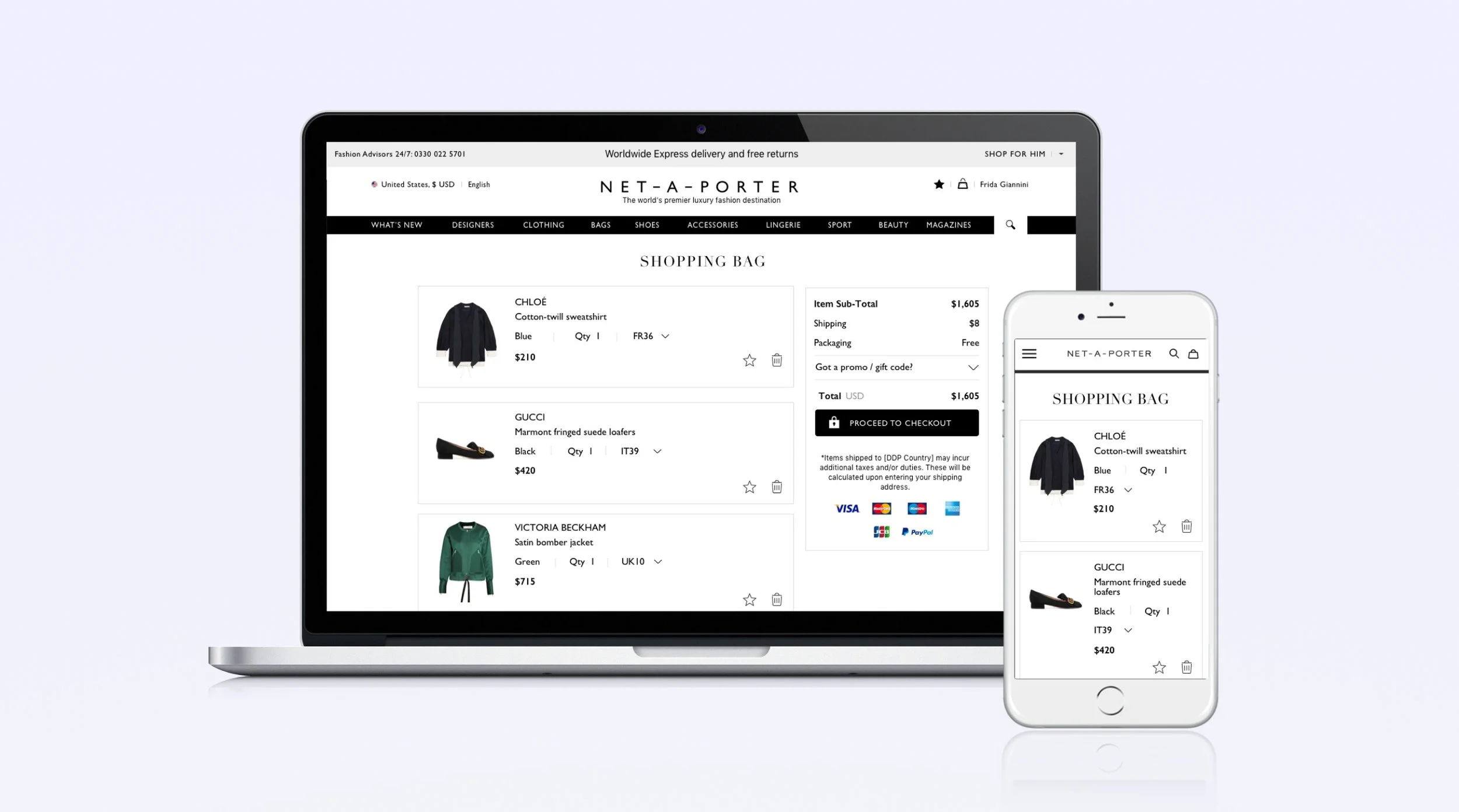
Old design
Wireframe
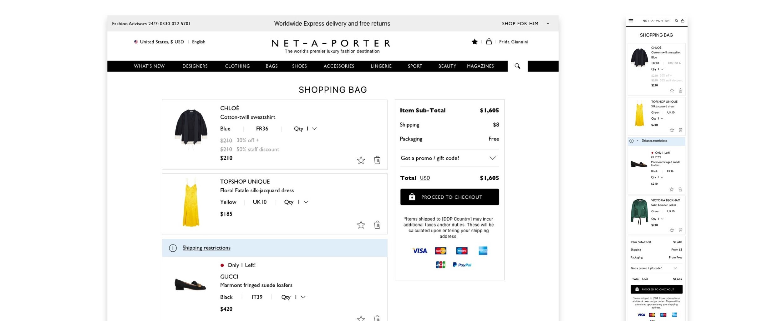
We created a modular block style for each product which allows for responsiveness. We also stress tested for a variety of scenarios including multiple price reductions, shipping restrictions of products across different countries and communicating Out of stock products clearly.

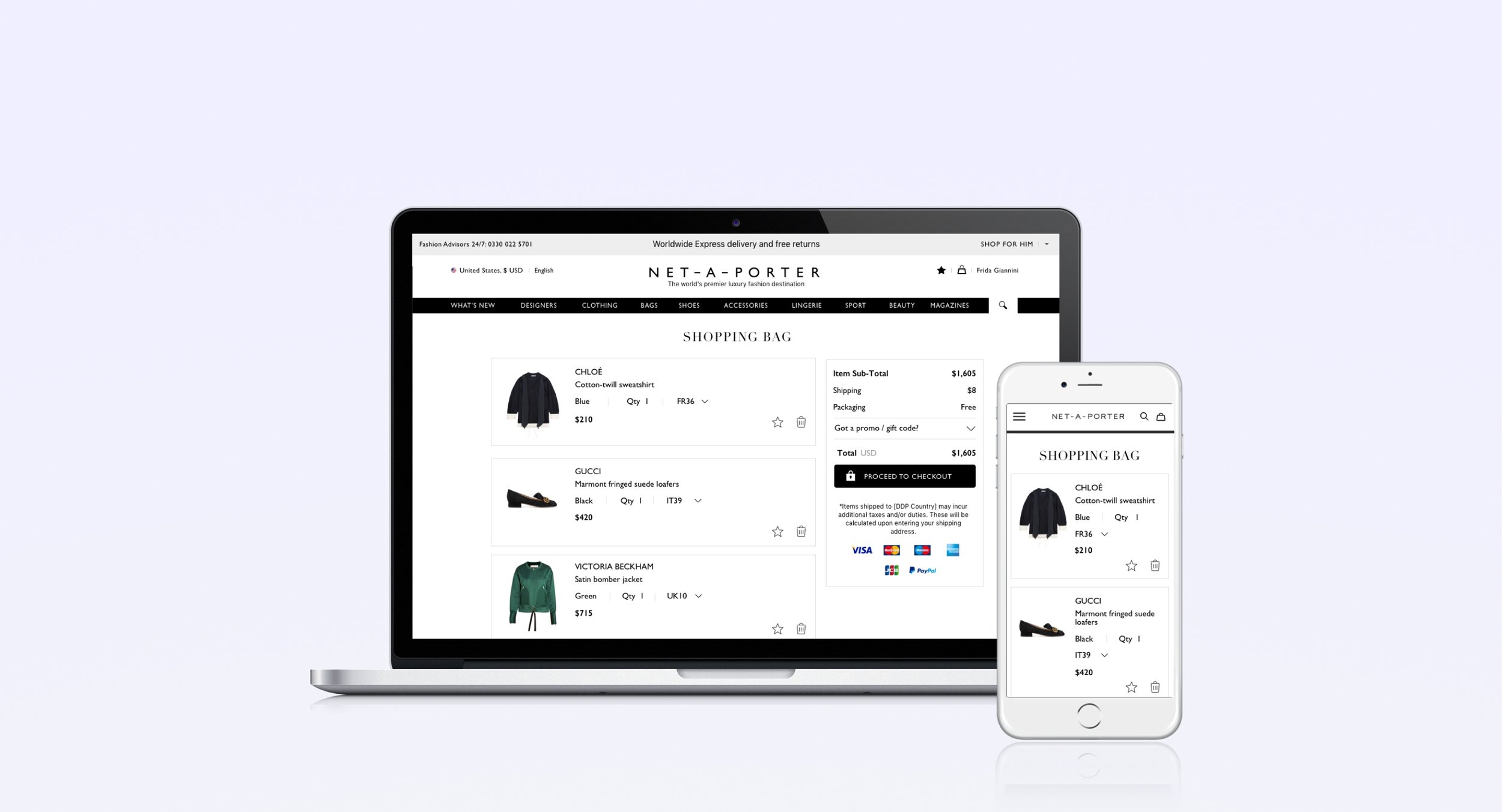
New designs
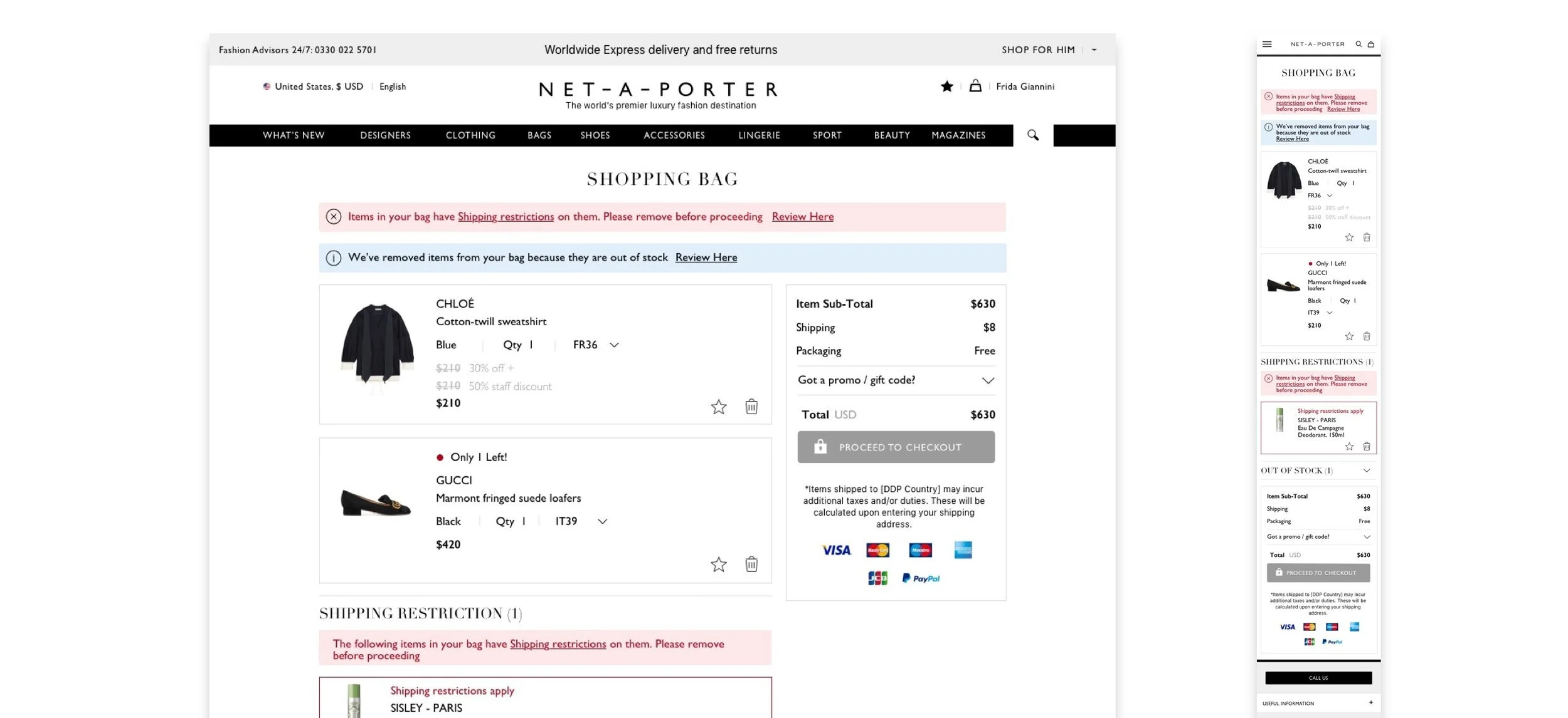
It was important to create clear error messaging, with icons and colour to convey the action the user needs to take.
The new Shopping bag was intuitive and responsive, which allows for less friction on smaller screens with clear messaging and interactions.
Sold out items are clearly communicated, removed automatically from the main basket, placed in a section for the user to review. This help the user to focus on completing the journey.
Error messaging
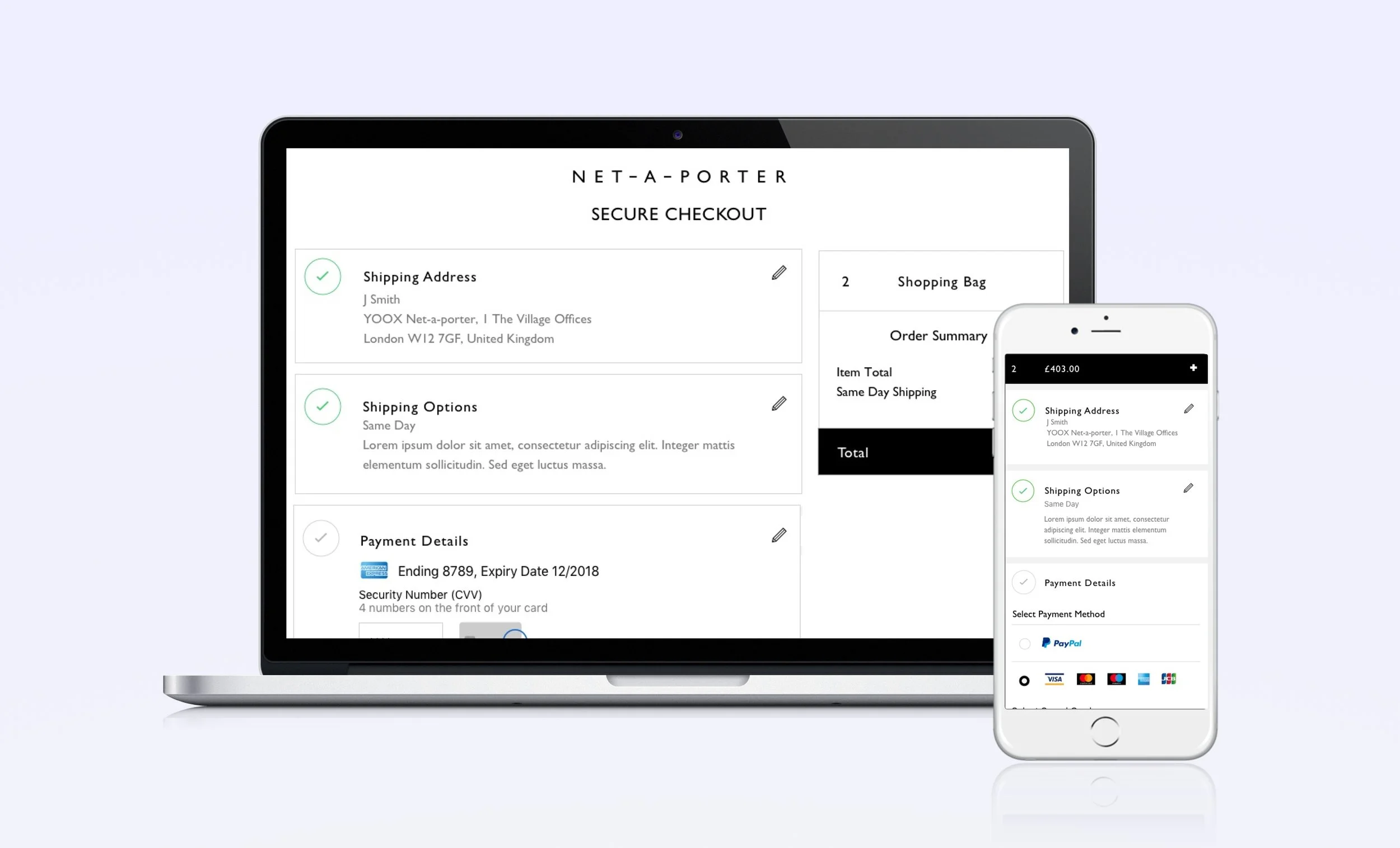
Checkout
Challenge
The checkout experience doesn’t reflect YNAP’s luxury brands. The design is dated, it is not intuitive and the mobile design is not responsive which results in many users not completing their purchase.
Goal
Create a unified and fully responsive application checkout experience across all brands, with clear simple steps and feedback messaging.
Old design
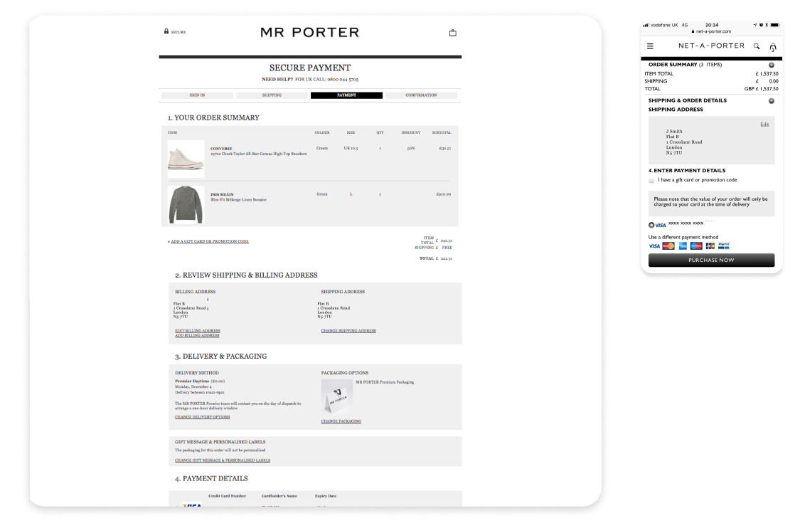
Not responsive for mobile, the text is shrunk and too small to read
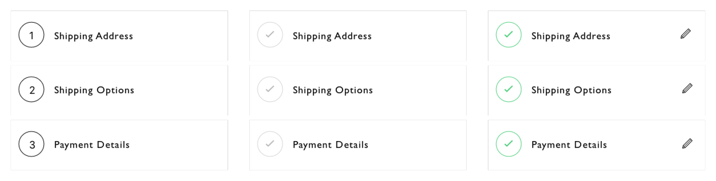
Unclear steps on web, there is a stepper at the top and numbered steps down the page
No stepper on mobile, so users don’t know how long it will take
Check out form is not optimised
Designs concepts
Using the mobile first approach we created a simple 3 step modular process that is responsive.
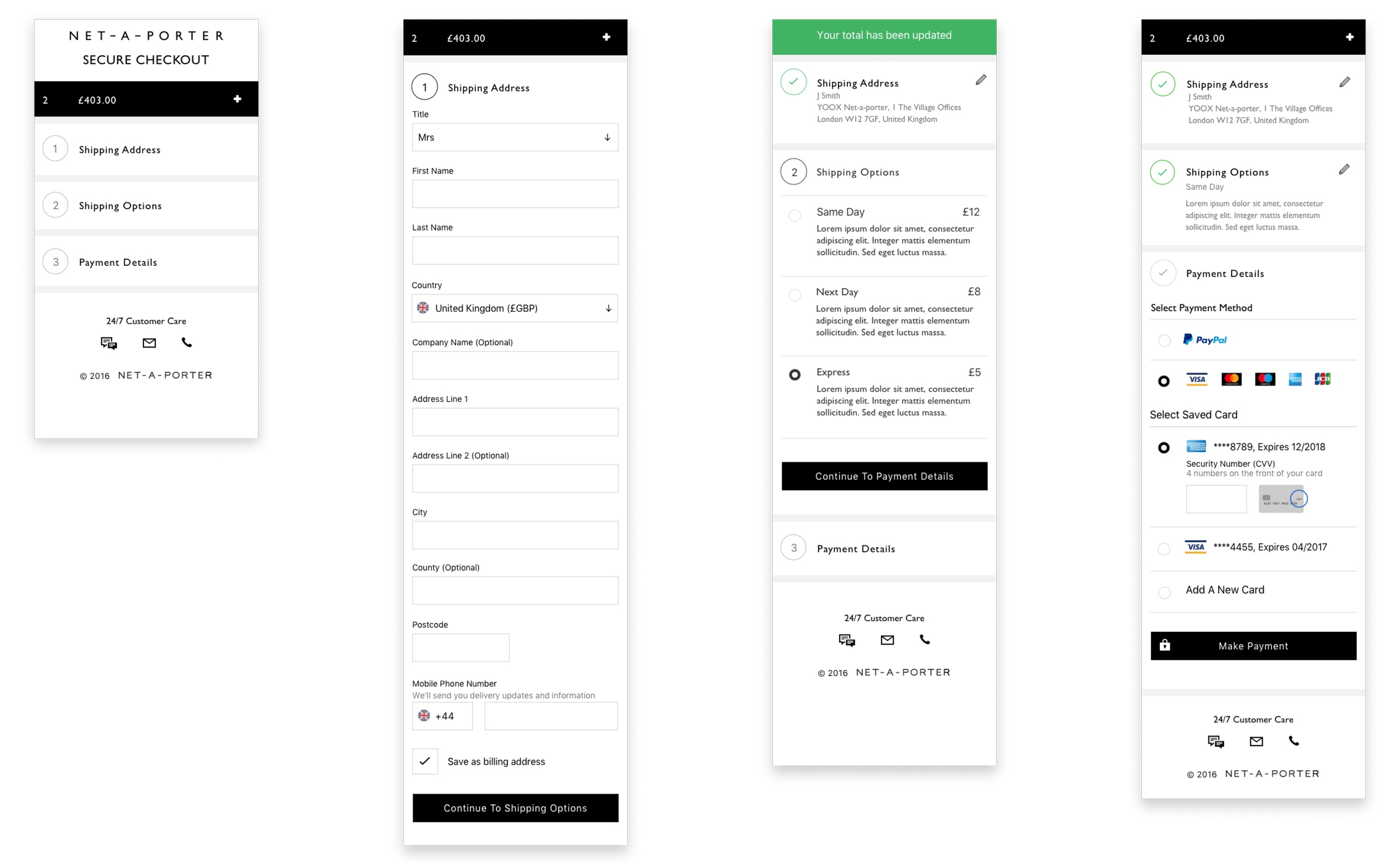
Final Designs
Please be aware this page is not linked on the main home page